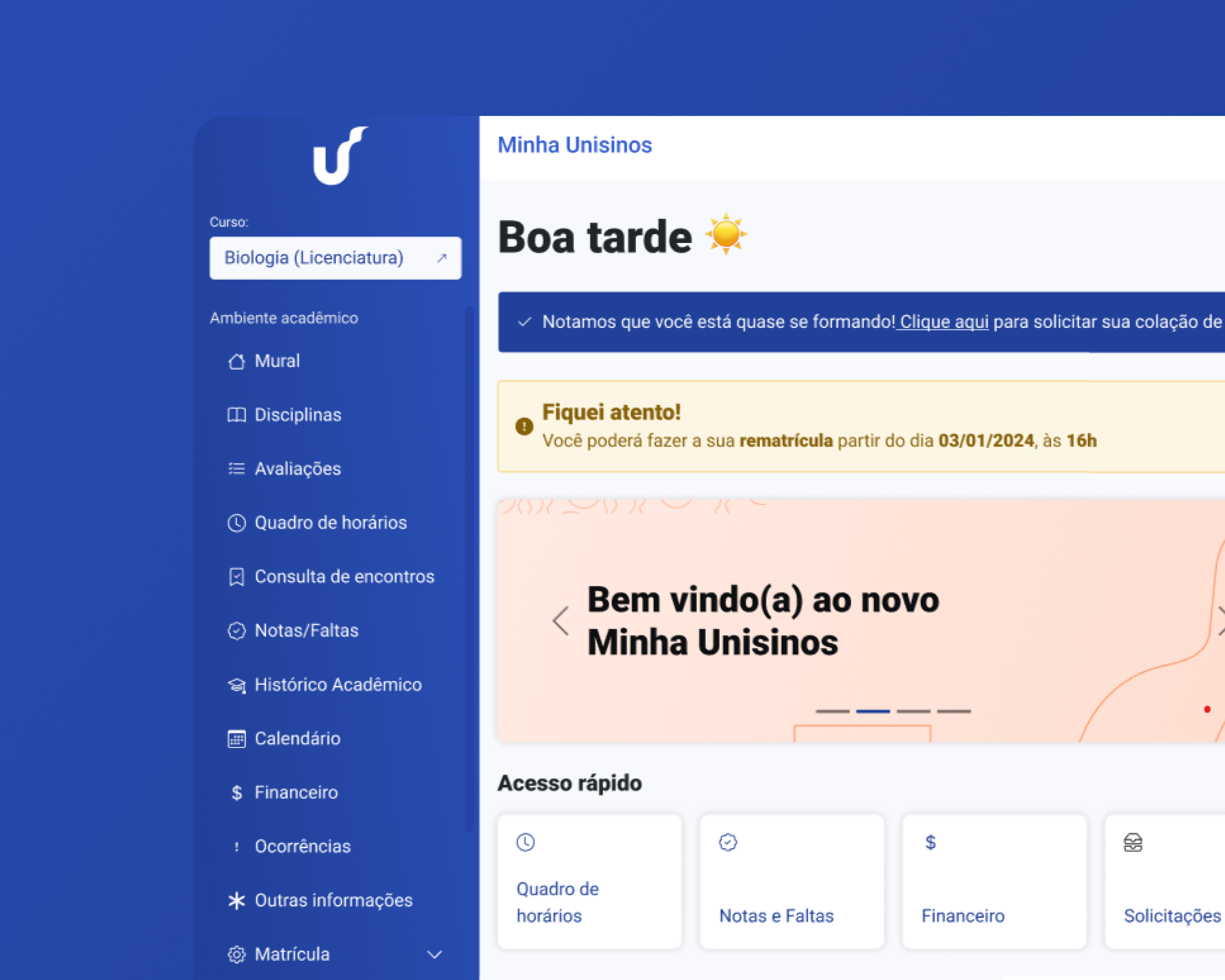
Home (New Start Page)
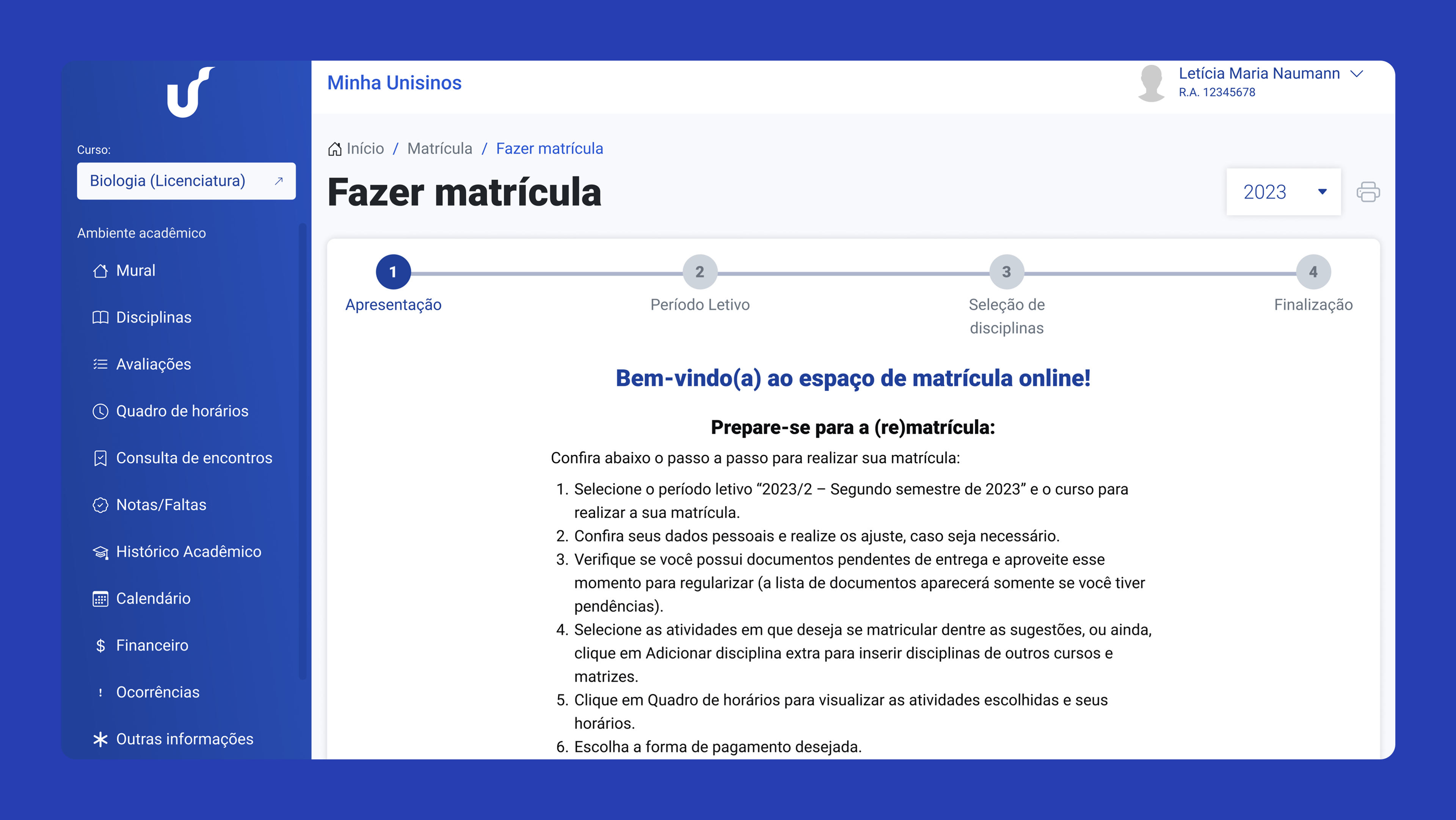
A unified entry point with shortcuts to grades, classes, financial info, messages, and upcoming assessments, improving visibility and reducing navigation loops.
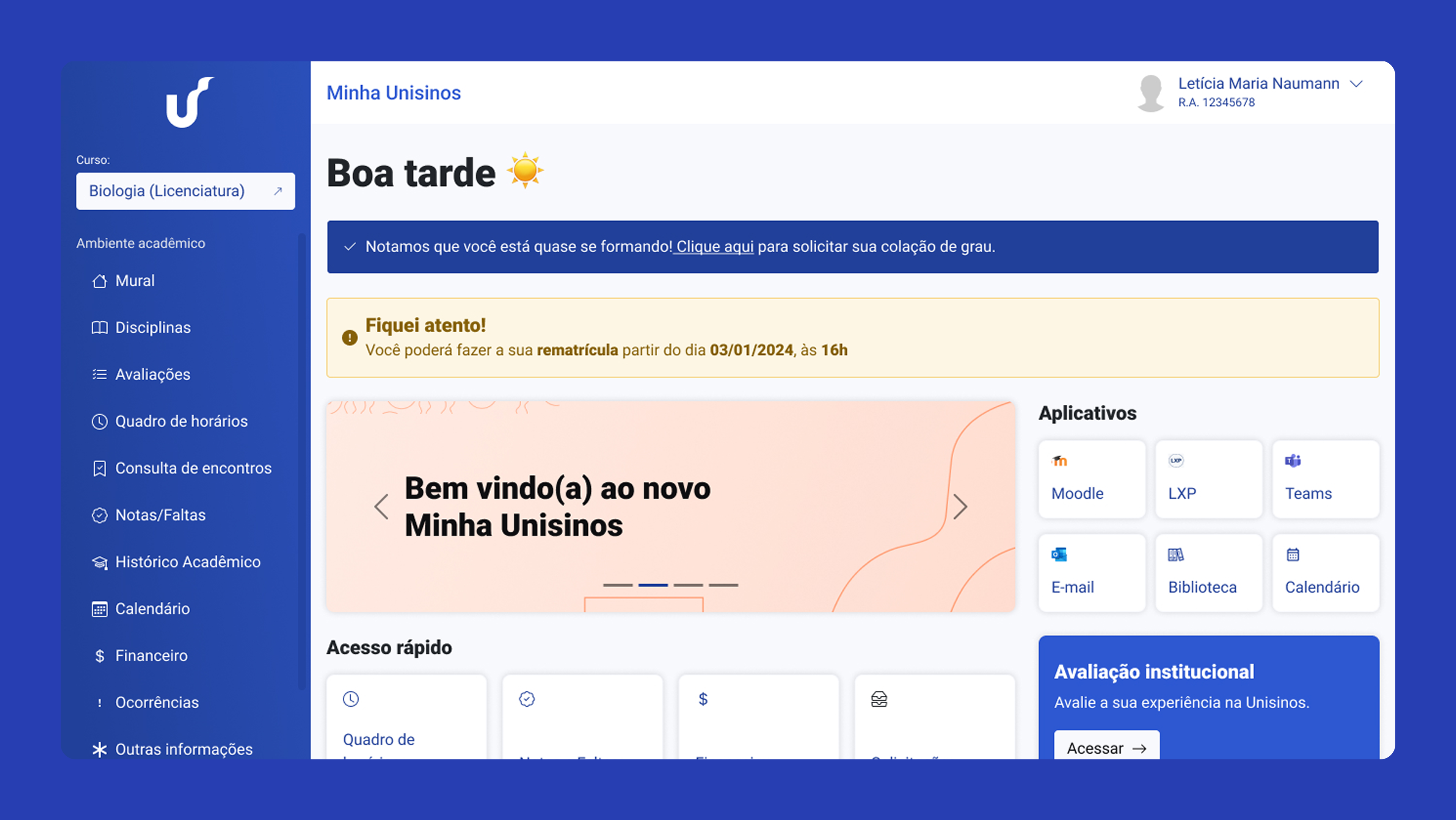
A centralized, intuitive, and responsive platform that simplifies academic life for 20,000+ students through clarity, structure, and improved communication.
Position
UX Specialist
Company
Unisinos – Leading Educational Institution
Platform
Web App (Desktop + Mobile)
Duration
2 months (Nov/2023-Dez/2024)
Team
Me + Engineering Team
Tools & methods
Figma · Figjam · Notion · Surveys · Interviews · Usability · Tests
The institution’s legacy student portal – used by more than 20k students – was fragmented, slow, and visually outdated. Essential information such as grades, schedules, and financial updates was buried across multiple pages. Academic teams also struggled to reach students due to poor visibility of messages and alerts.
The portal was built on a legacy vendor platform (TOTVs), limiting what could be changed. We couldn’t rewrite core logic, only reorganize content, improve layout, and add new pages on top. Navigation was confusing, important actions took too many clicks, and notifications were nearly invisible. Expectations between stakeholders (UX, branding, and leadership) often conflicted with technical constraints.
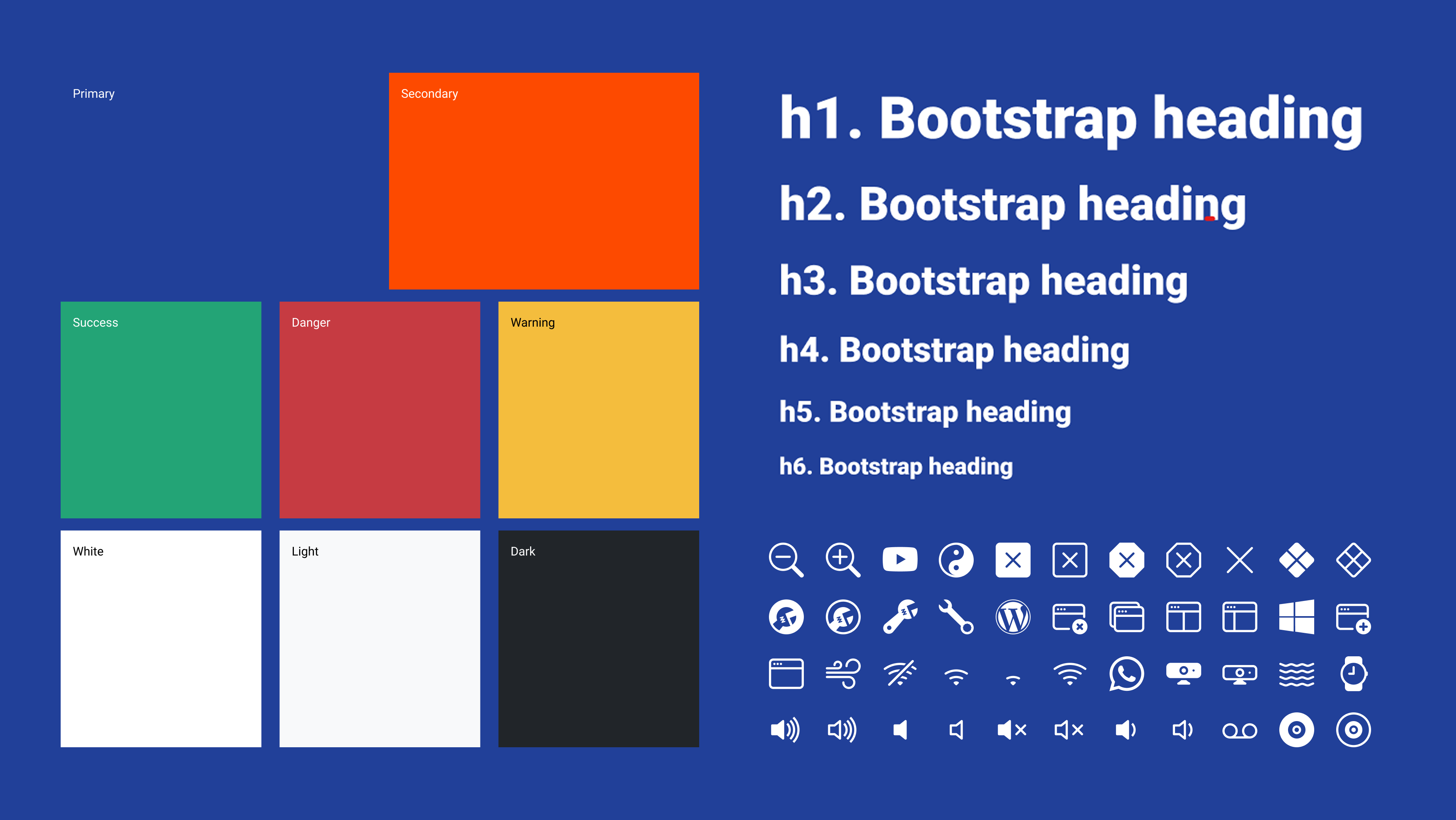
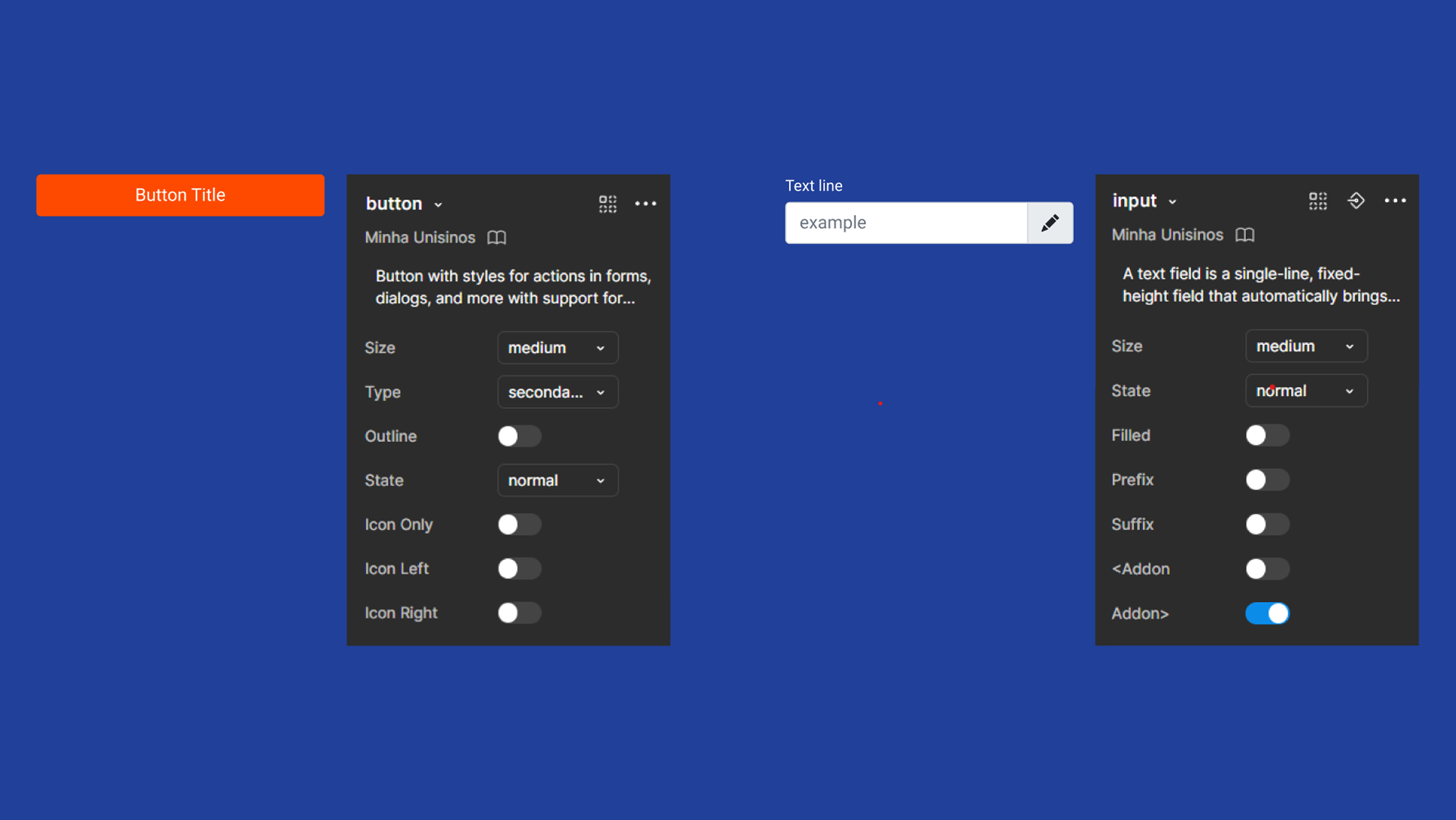
I led user research, mapped academic journeys, restructured the portal’s information architecture, and redesigned key interfaces with a focus on clarity and mobile usability. To support the engineering team’s constraints, I also created a lightweight design system based on Bootstrap, ensuring feasible implementation and consistent UI across new pages.
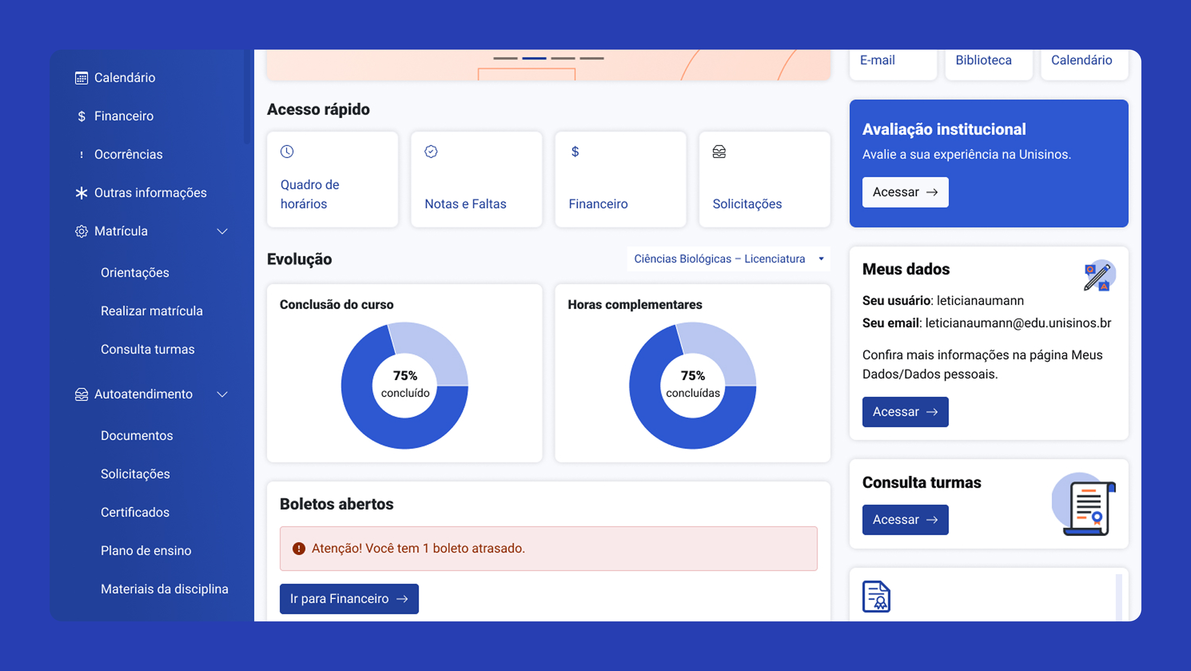
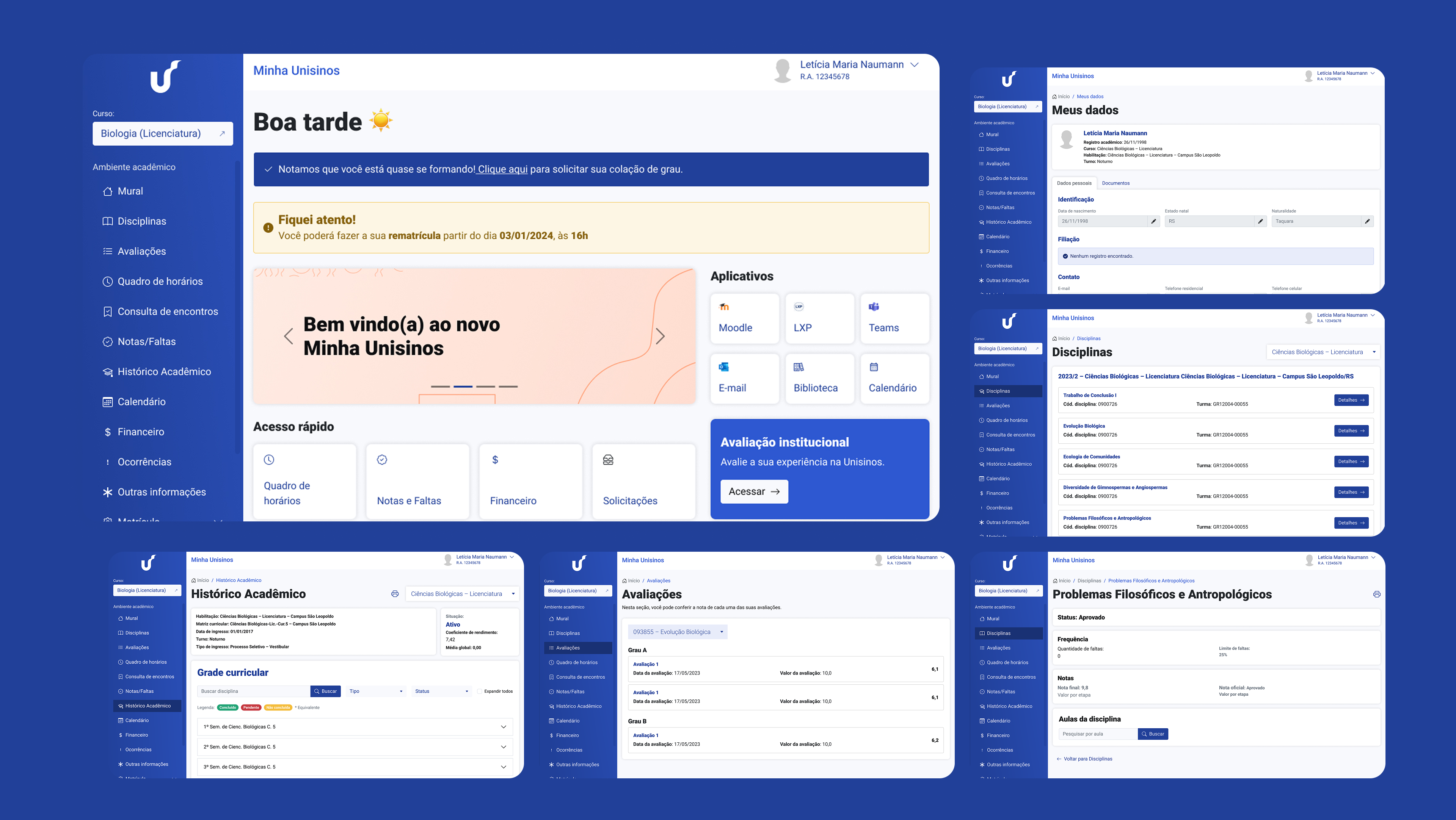
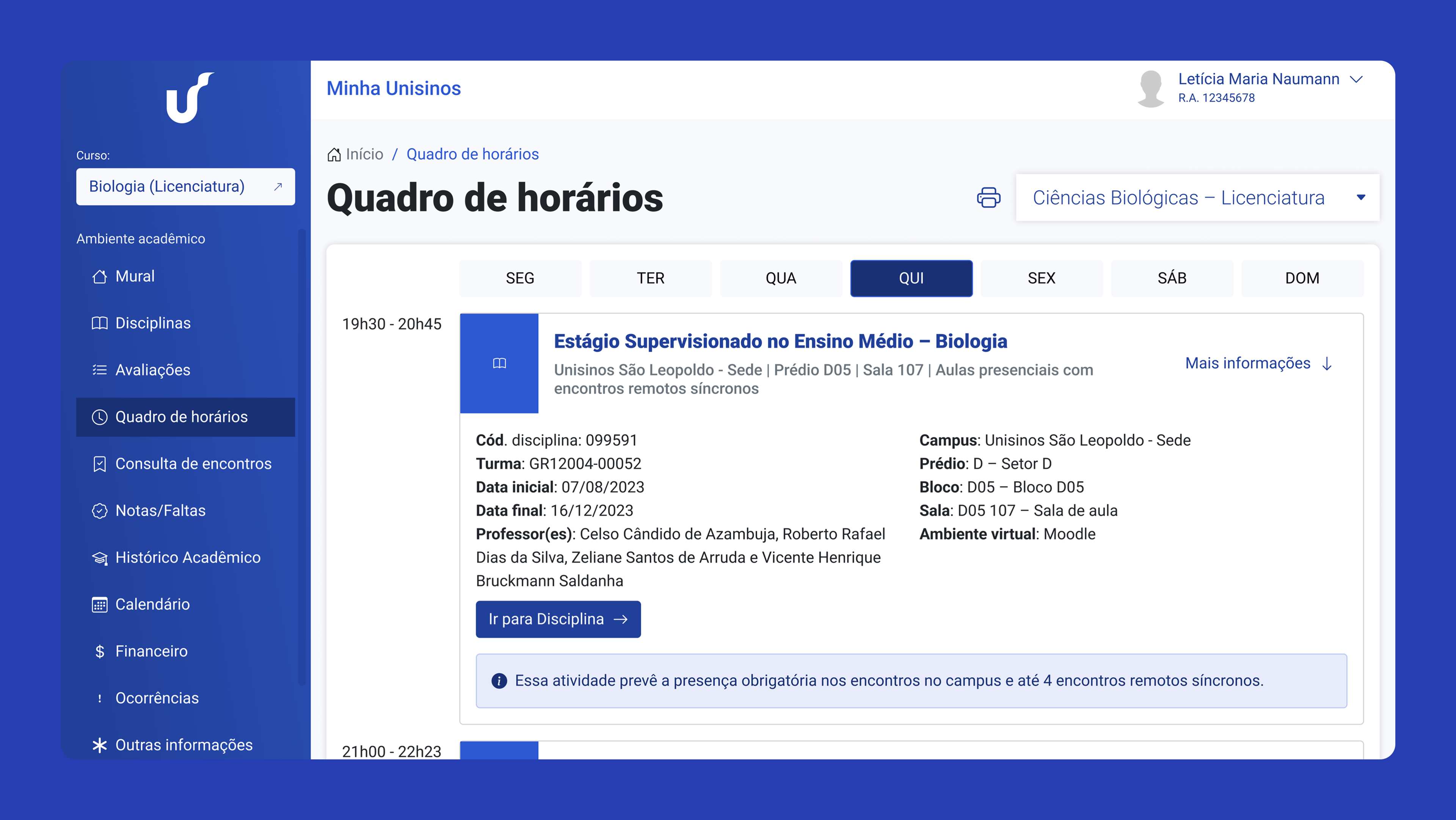
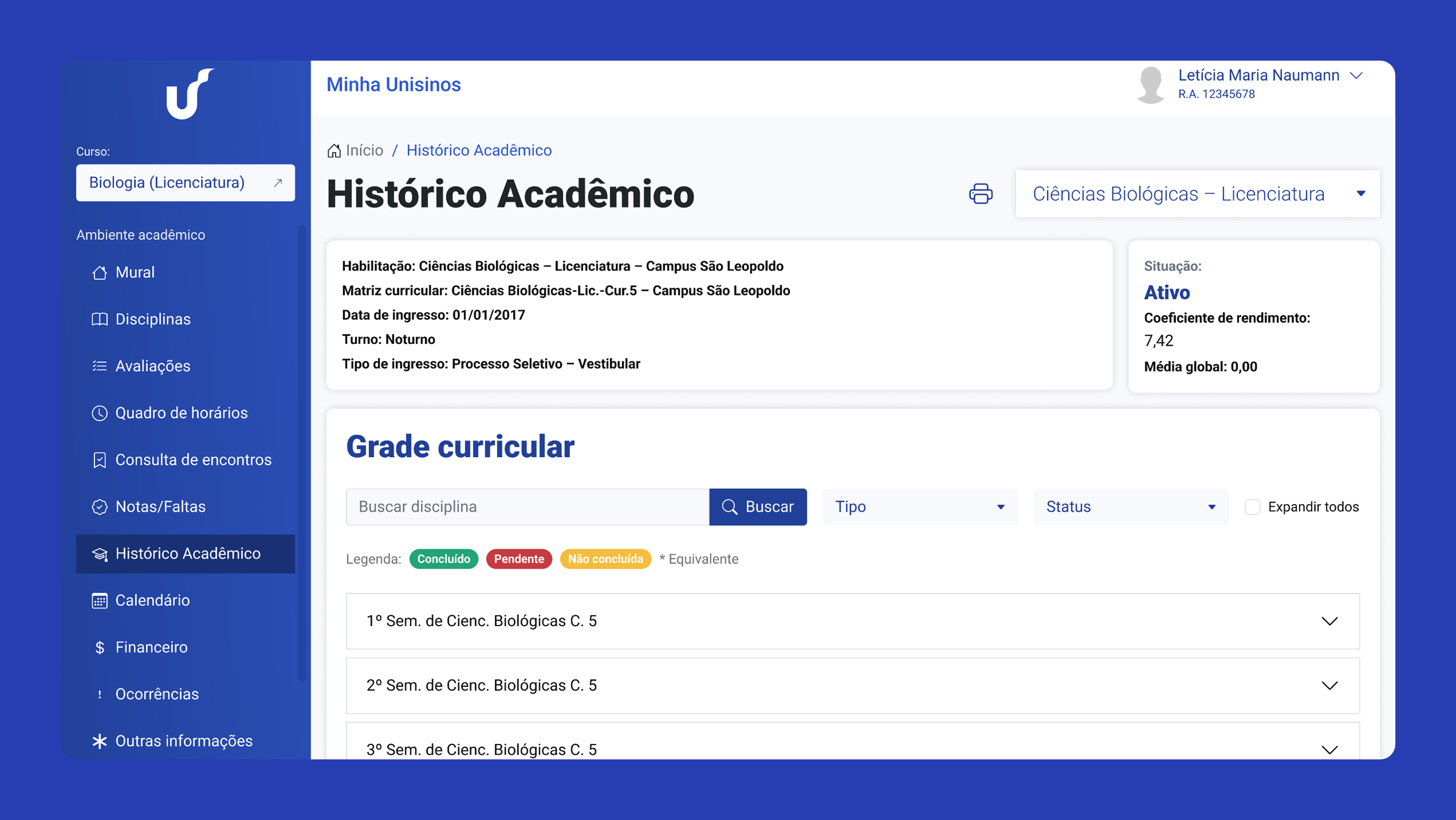
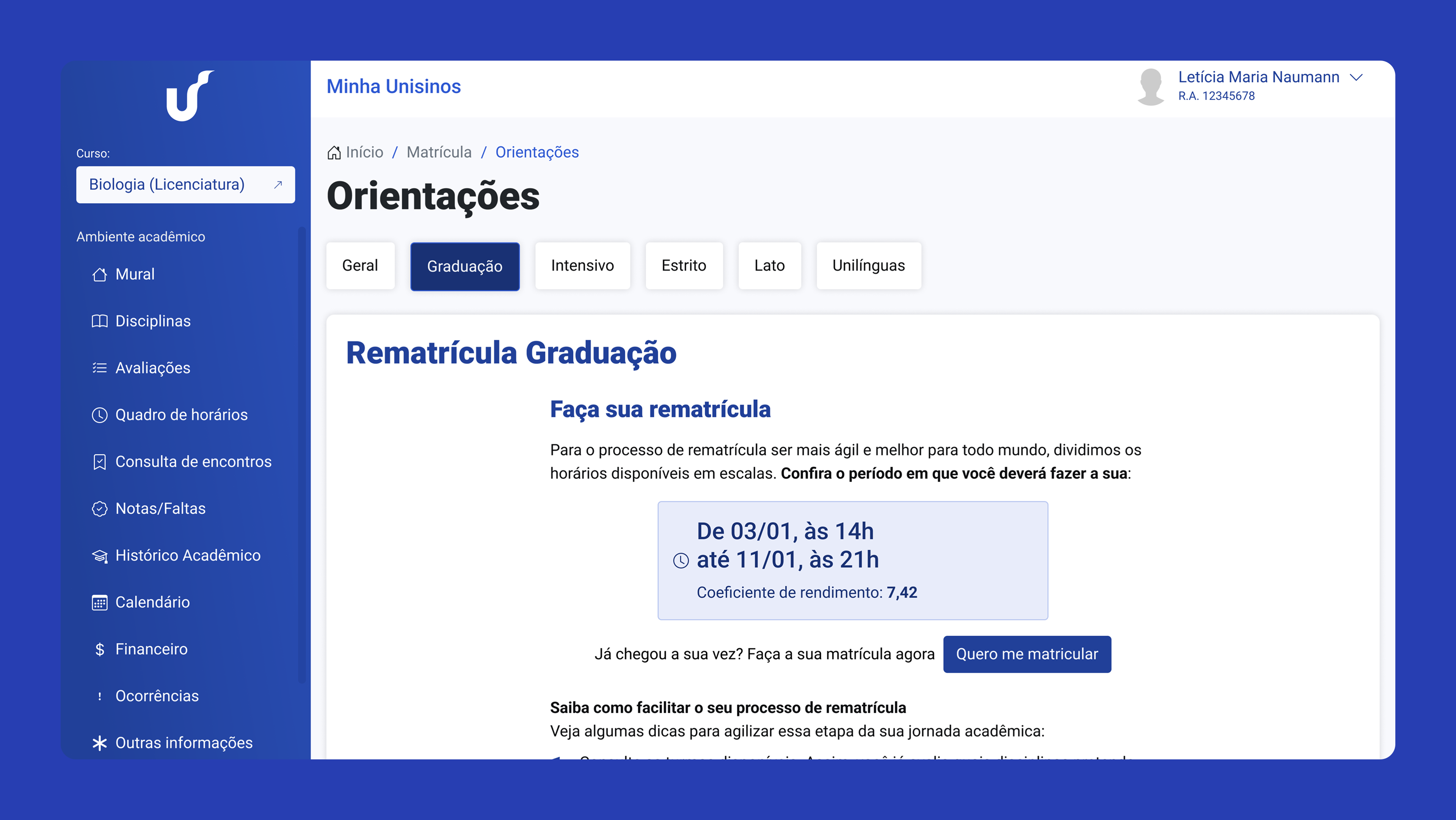
We redesigned the Student Portal around clarity, structure, and mobile-first access. A new Home page brought shortcuts, alerts, and academic status into a single, visible entry point. Navigation was rebuilt to reduce friction and minimize search time. Pages for grades, class schedules, documents, and enrollment were reorganized with clear hierarchy and predictable patterns. New communication areas improved visibility of messages, tutorials, and institutional announcements.
Navigation redesigned to reduce time spent searching for data.
Grades, classes, and financial updates surfaced directly on the Home page.
Messages, alerts, and institutional content became more visible and structured.
Fully responsive layouts supported students’ dominant use on phones.
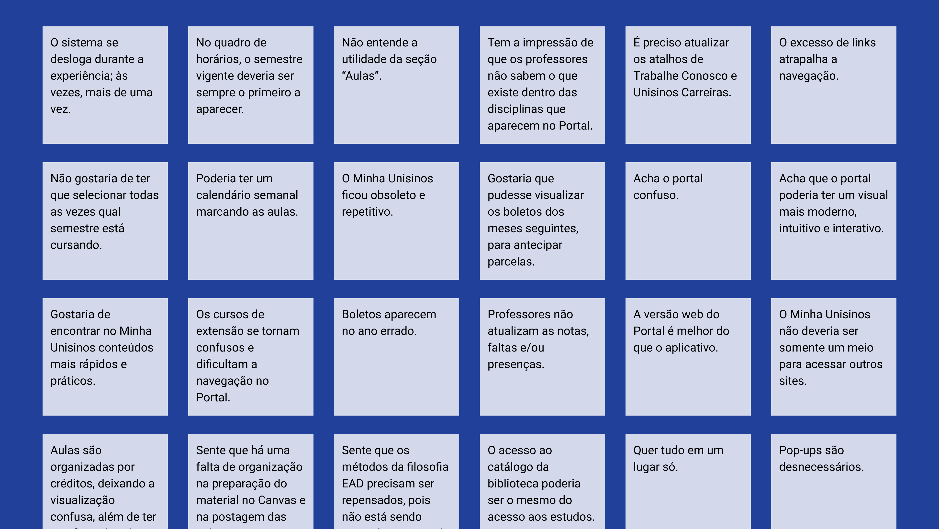
Surveys + interviews revealed daily student needs and the pain of “not knowing where to click.”
Tools: Google Forms, Notion, Figma
Benchmarking + portal audit exposed gaps in content hierarchy and overloaded navigation.
Tools: FigJam
Wireframes and high-fidelity prototypes tested with students and faculty guided a simpler architecture.
Tools: Figma
Components, spacing, color, typography, and responsive patterns built into a lightweight Bootstrap-based system.
Tools: Figma
Specifications documented for engineering implementation within vendor limitations.
Tools: Notion
Research revealed that the portal’s core issue wasn’t aesthetics – it was orientation. Students consistently reported: “Não sei onde clicar”. Essential tasks (checking grades, accessing classes, seeing financial alerts) required too many steps. Tutorials and key messages were hidden behind unclear menus. Academic teams also needed clearer spaces to communicate with students. These findings shaped the redesign: reduce clicks, surface what matters, and prioritize mobile-first access.
A unified entry point with shortcuts to grades, classes, financial info, messages, and upcoming assessments, improving visibility and reducing navigation loops.
Grades, attendance, subjects, assessments, history, and enrollment reorganized into a predictable, structured flow.
Tutorials, announcements, and benefits pages designed for clarity and institutional flexibility.
A lightweight component library built using Bootstrap principles to ensure development feasibility within the vendor’s constraints. Included typography, spacing rules, color tokens, UI patterns, buttons, cards, banners, and layout grids. The system reduced inconsistencies across pages and supported future incremental improvements.
Business impact
User impact
Team impact