Context
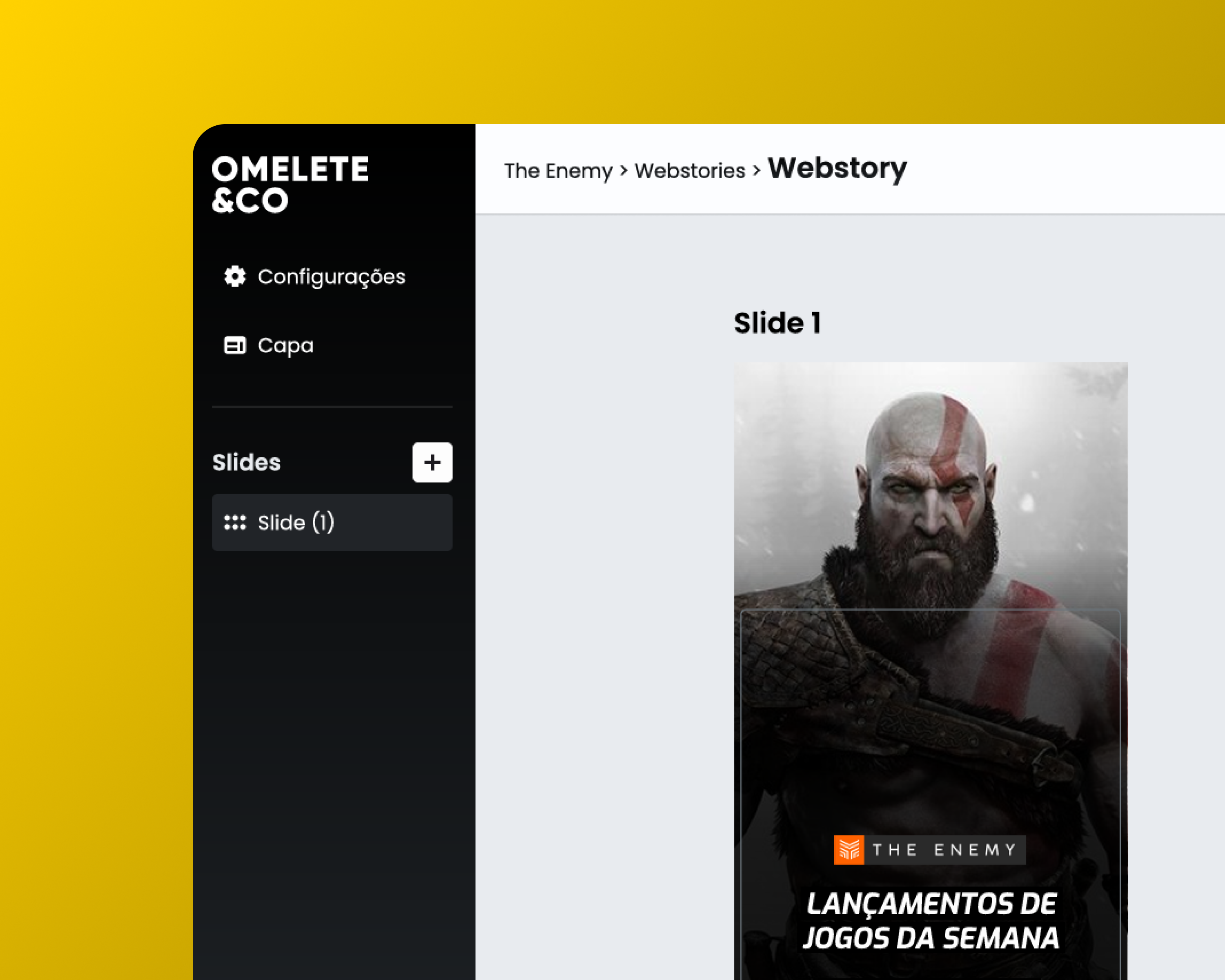
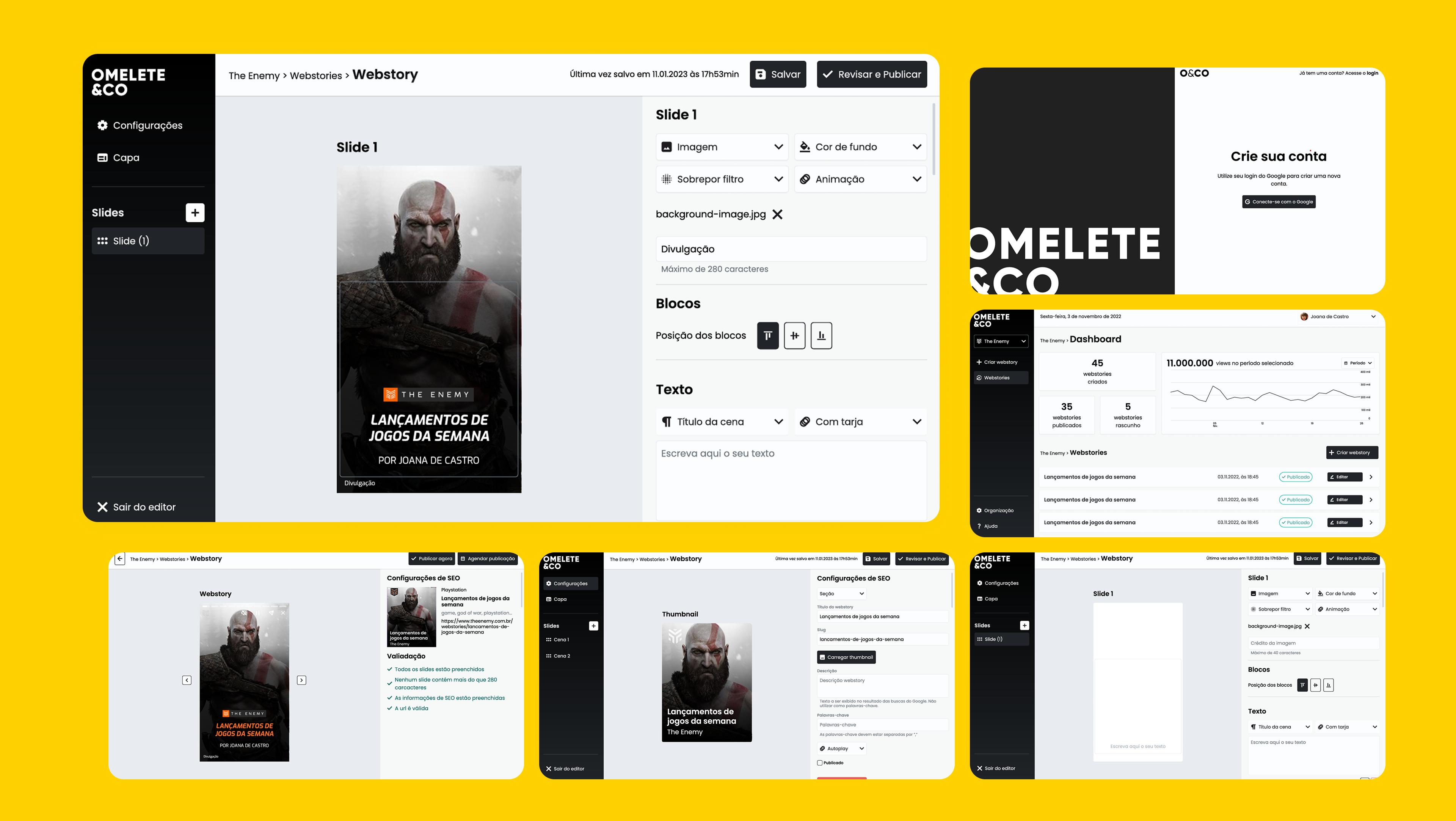
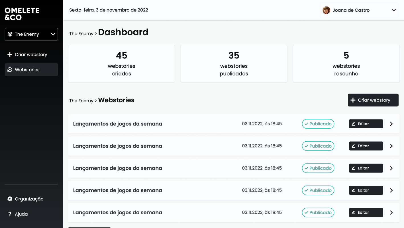
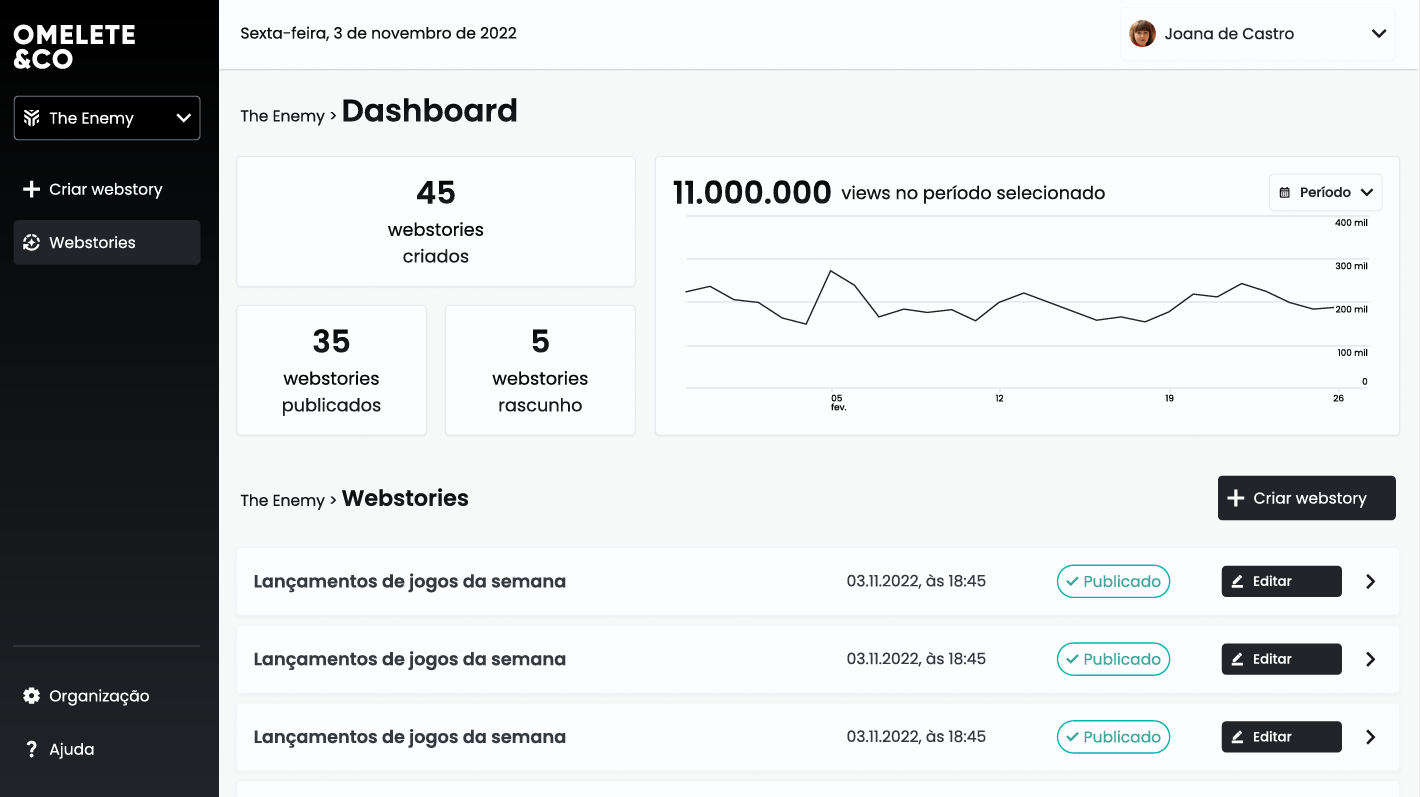
Omelete Company relied on an external tool to publish Web Stories, their highest-traffic content, with 4–5 stories produced daily for a 15M-monthly-user audience. When the tool became paid, the newsroom faced slow workflows, inconsistent layouts, and unstable previews. We needed an internal CMS fast and tailored to how journalists actually worked.
Challenge
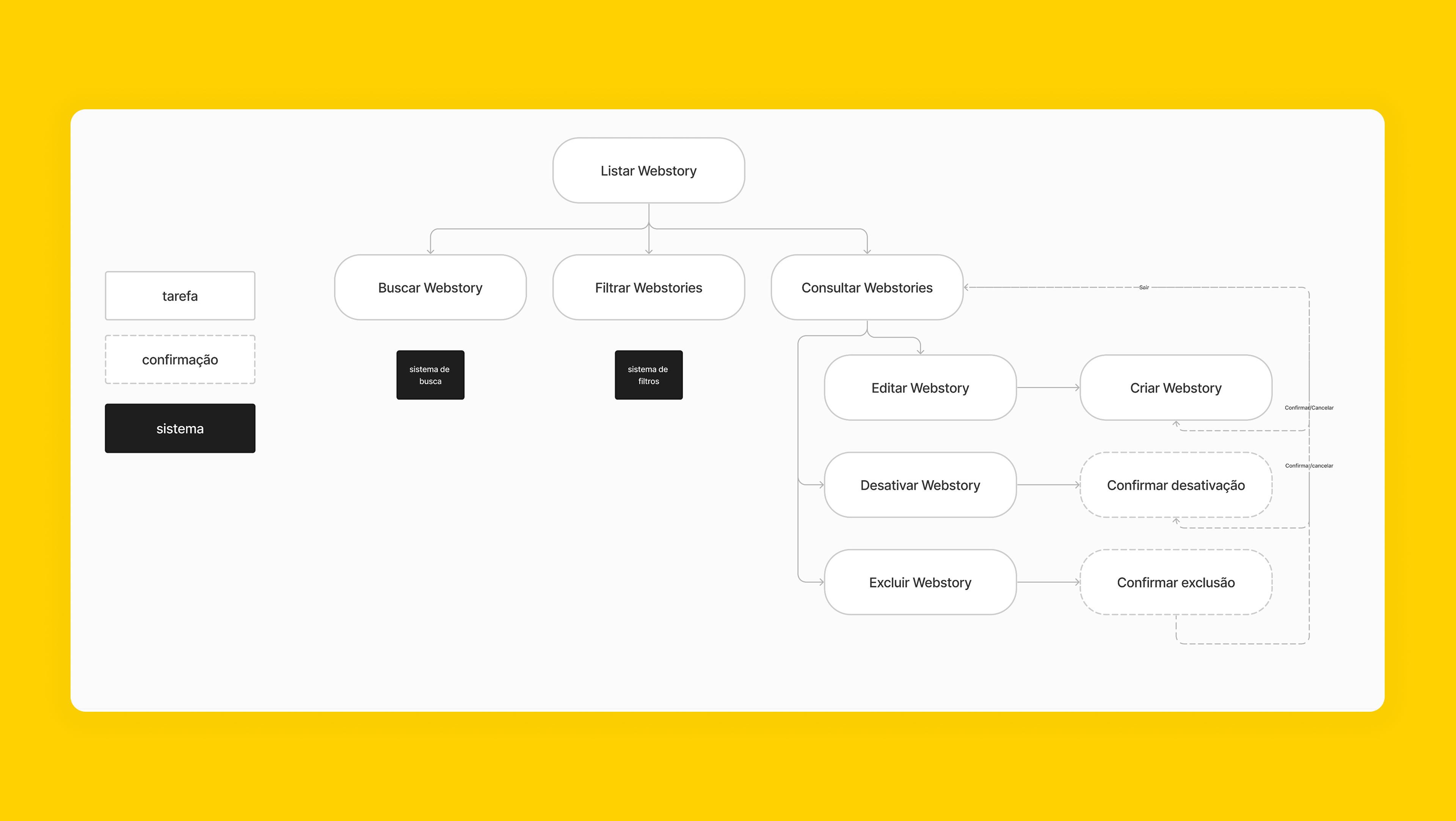
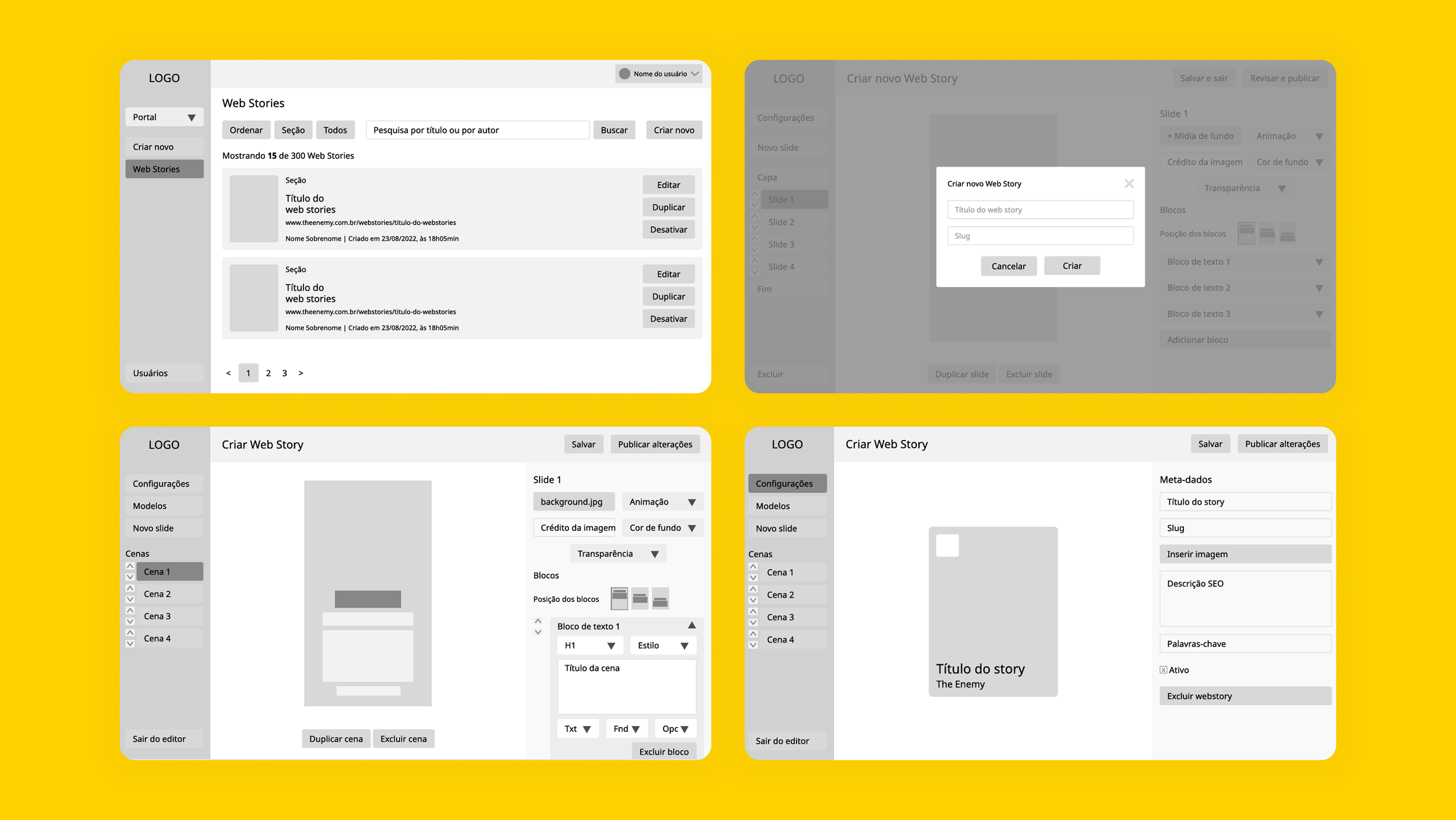
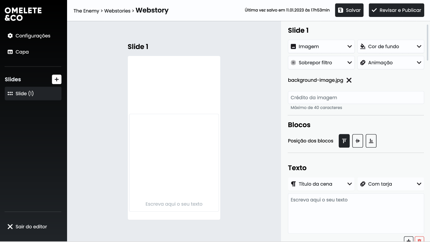
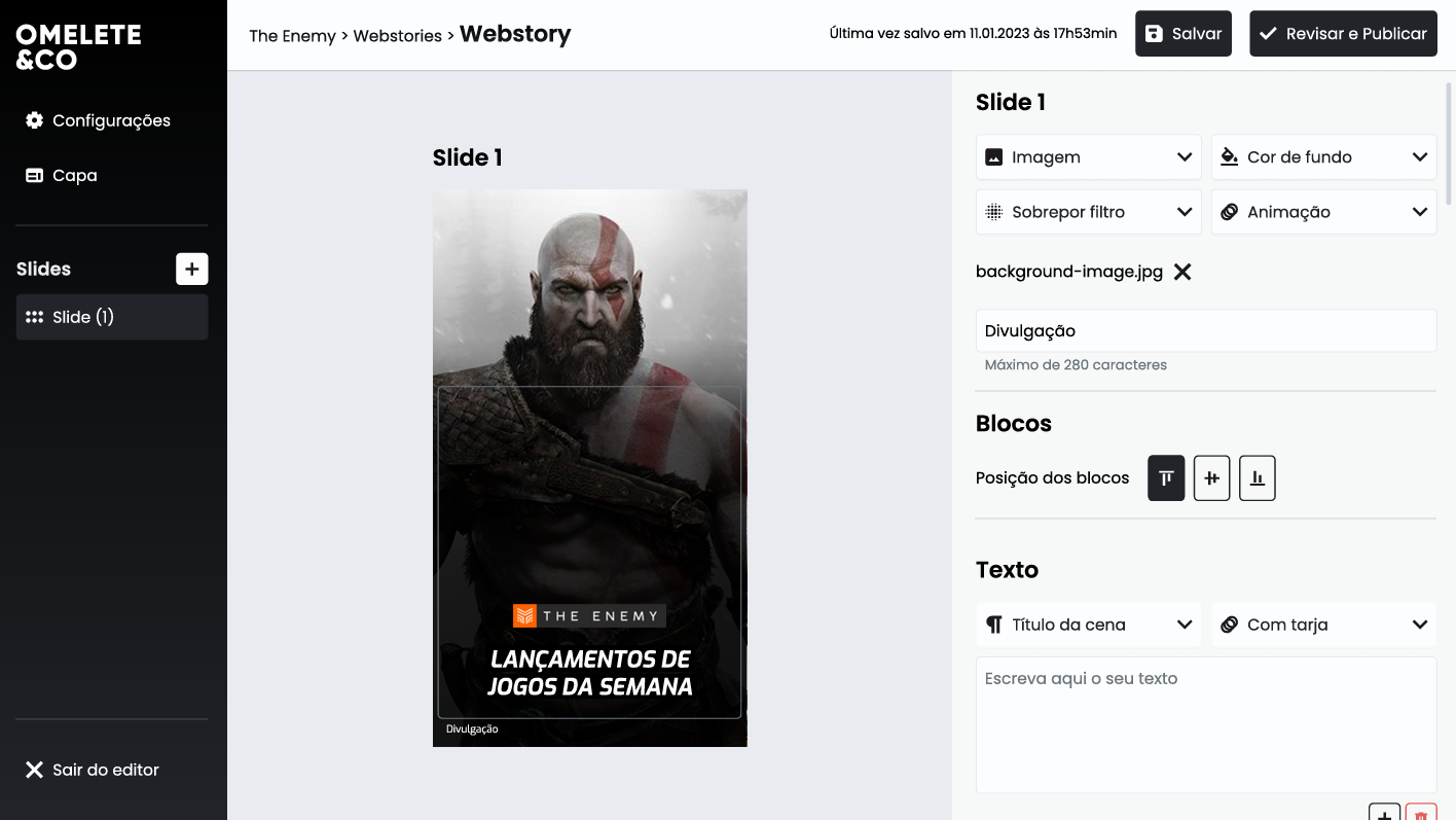
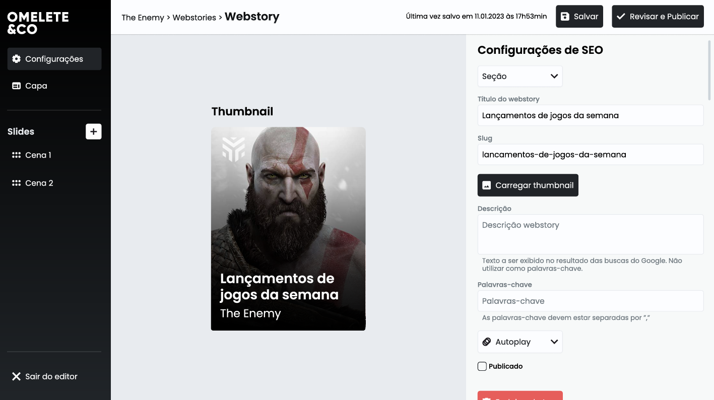
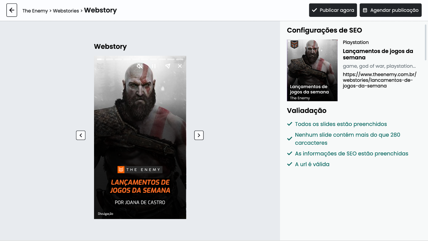
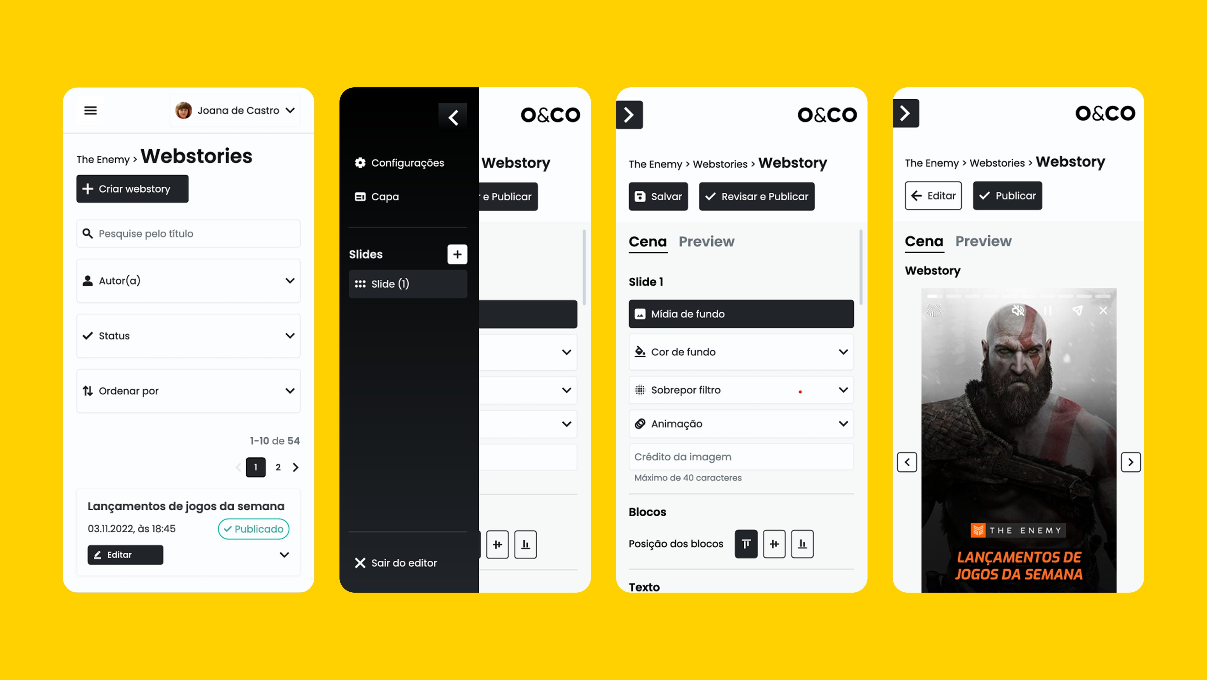
We had only 4 months to design and build a CMS that eliminated SaaS dependency, accelerated production, and reduced errors. Journalists didn’t want design tools or drag-and-drop interfaces; they needed clarity, predictability, and strong SEO validation. Engineering had to work within a fixed stack and strict scope.
My role
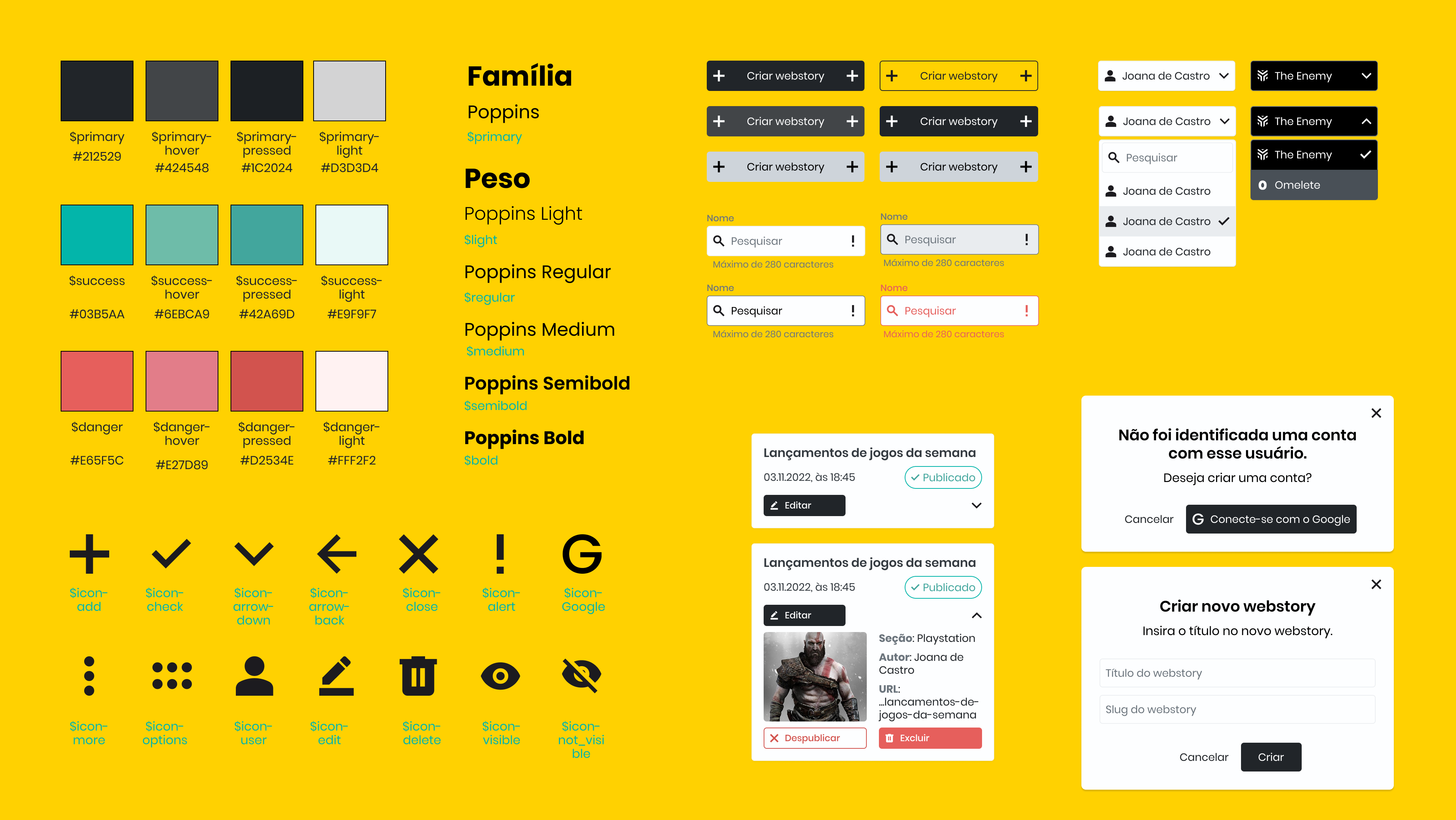
I led discovery, UX/UI design, interaction design, prototyping, testing, and the creation of the design system. I partnered daily with engineering to ensure feasibility and with journalists to validate flows, templates, and publishing rules through real editorial scenarios.