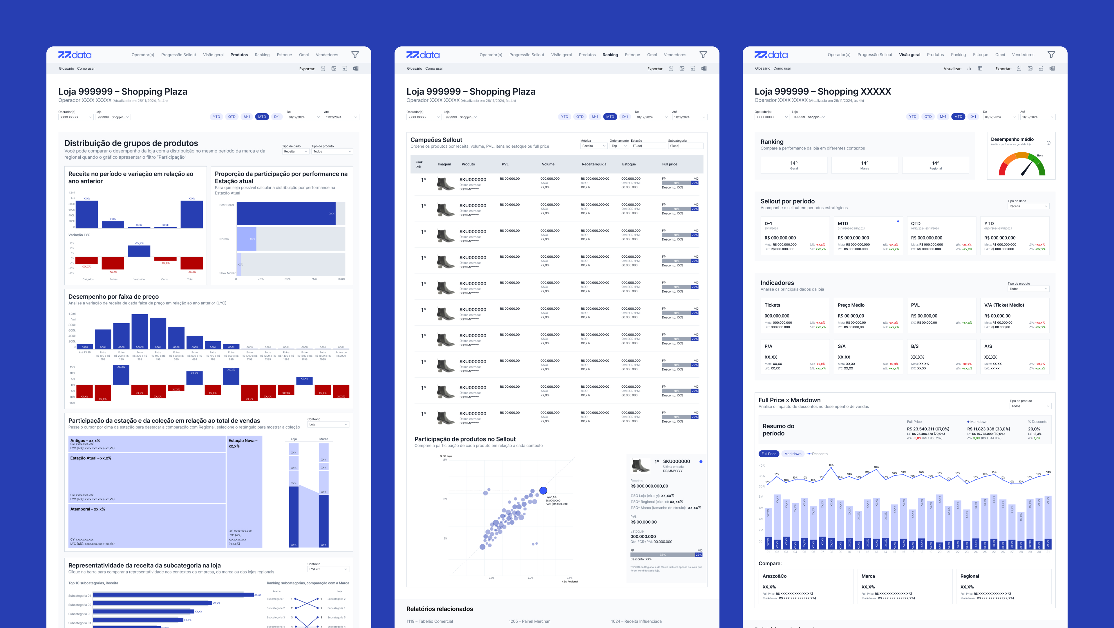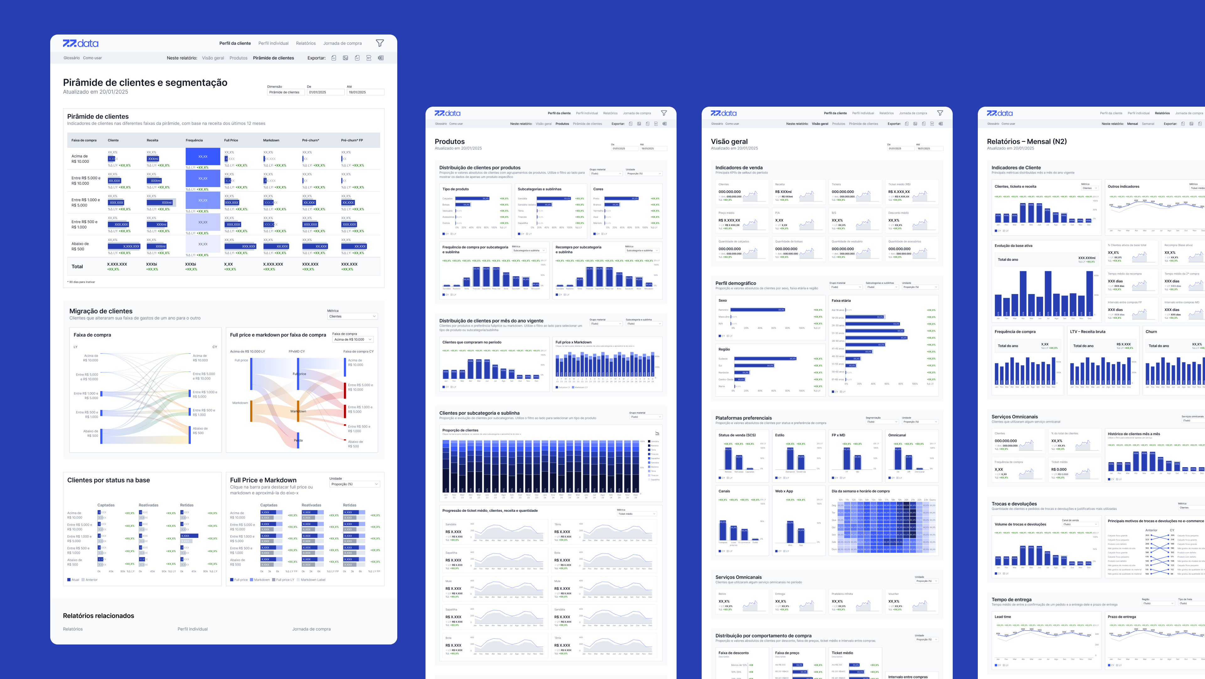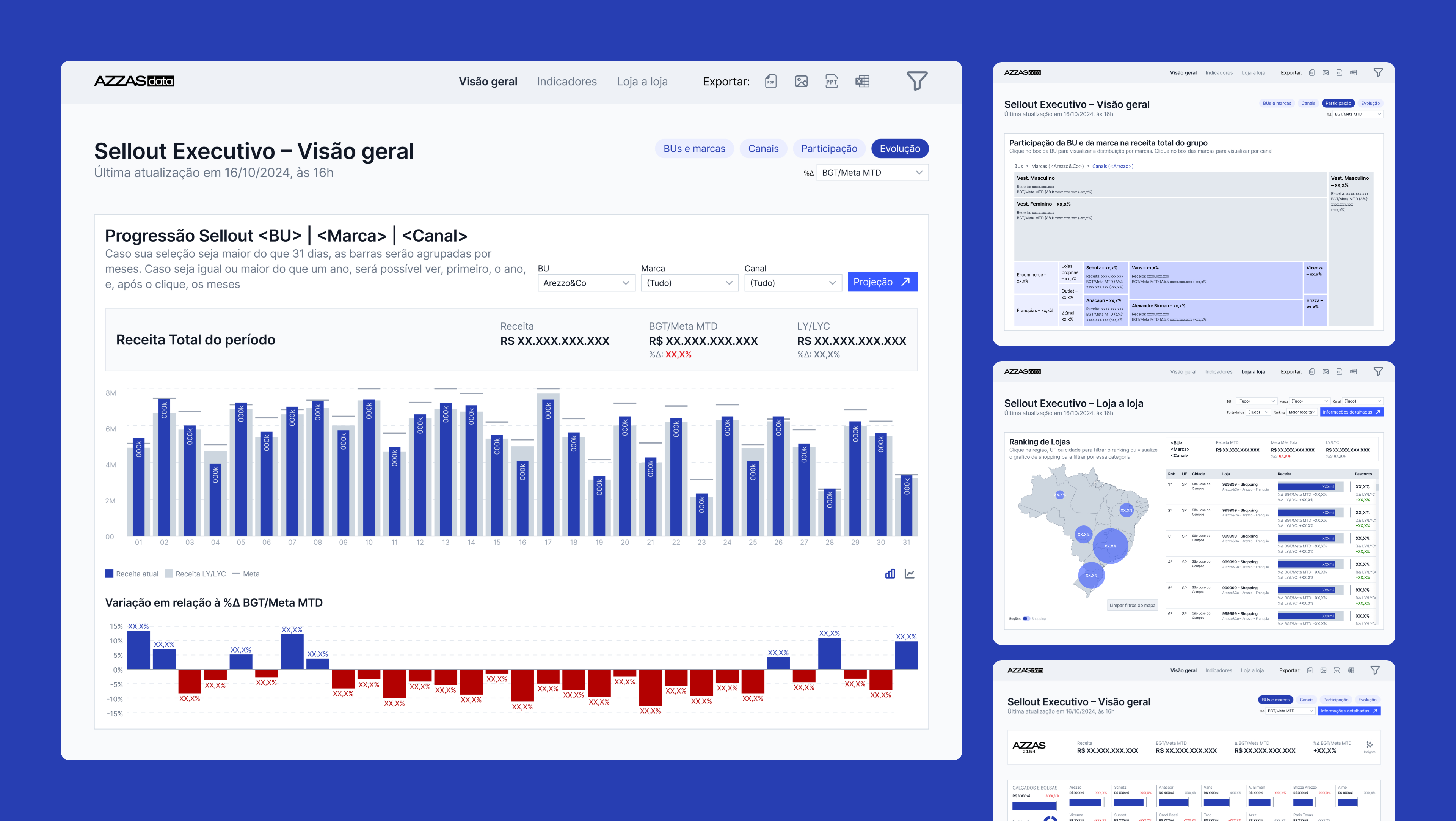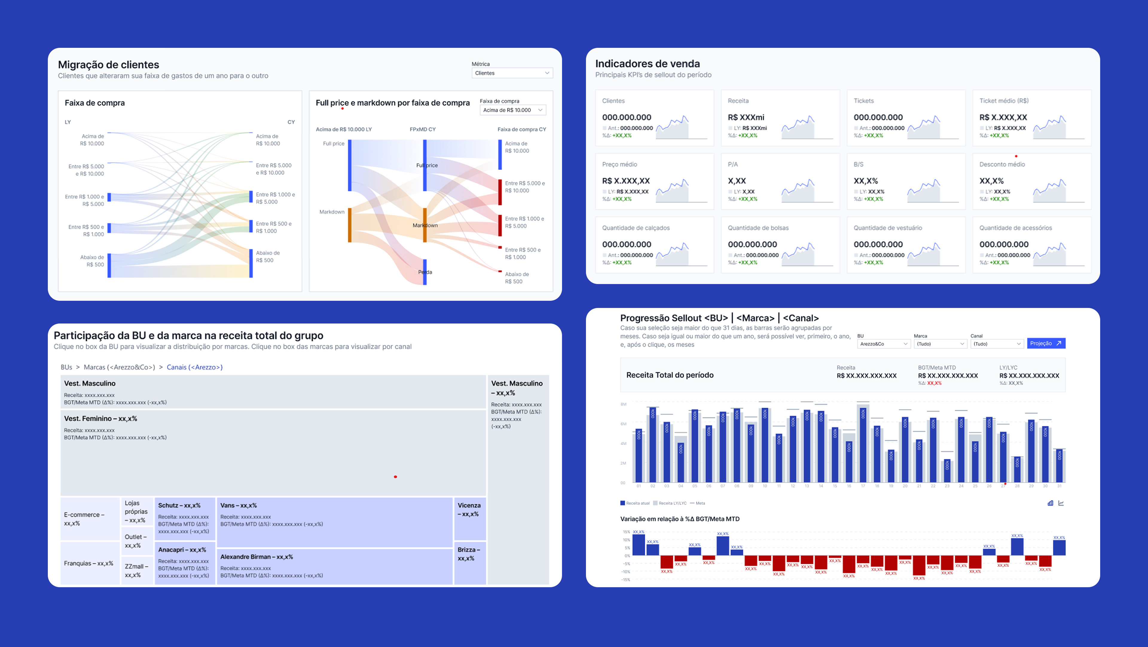
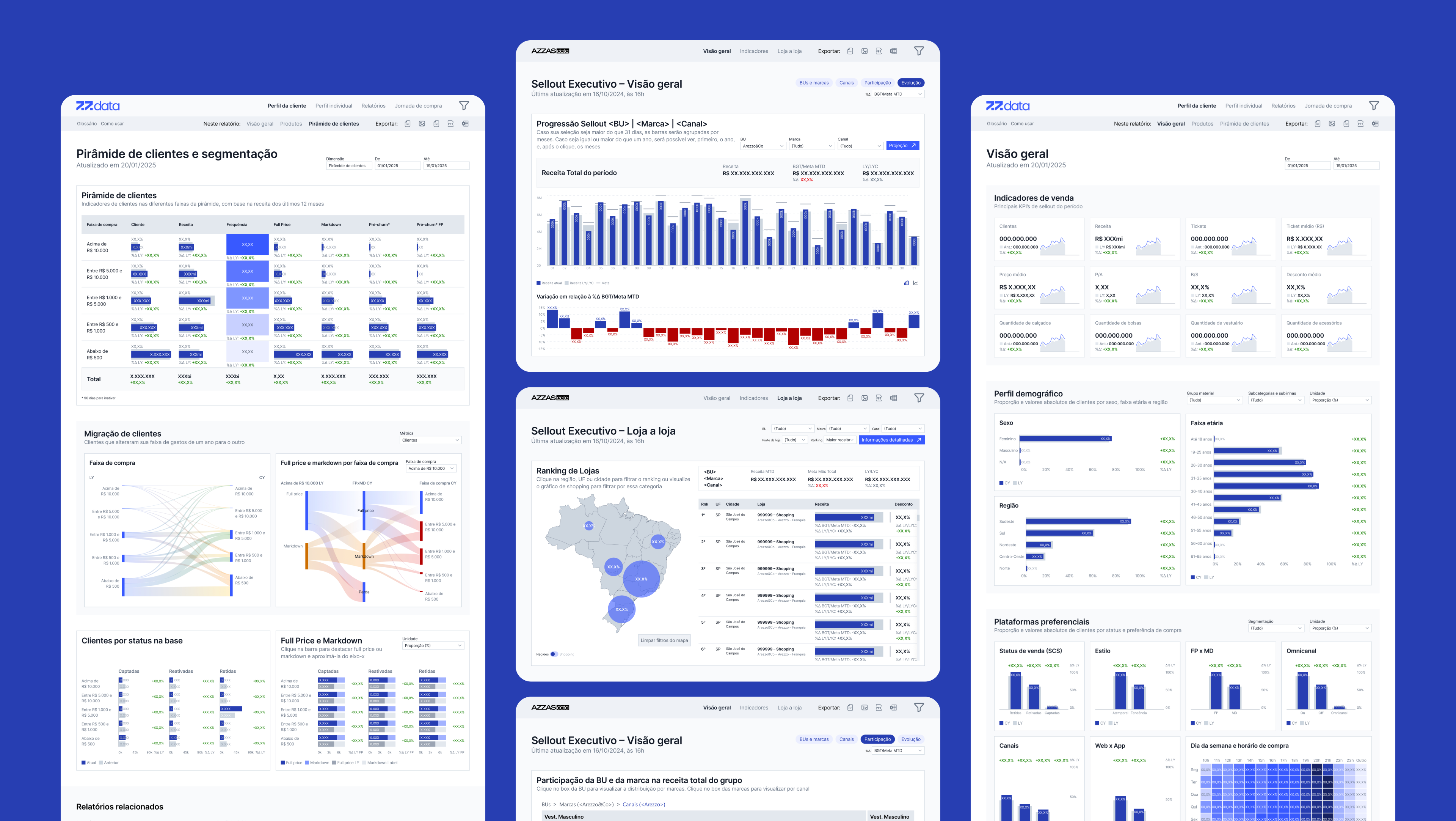

Store Overview (Raio-X de Loja)
Designed to give store managers, commercial analysts, and franchise owners a single, reliable view of store performance. Through interviews and workflow audits, we identified that users needed to quickly understand sales context, gaps, and opportunities without switching between multiple dashboards or Excel files. The new dashboard consolidated essential KPIs – sales, AOV, inventory levels, seller performance, and sellout trends – into a clean, drill-down structure that allowed users to explore data by store, operator, or cluster. A mobile version ensured visits and audits could be performed directly in-store, increasing on-the-ground decision speed.